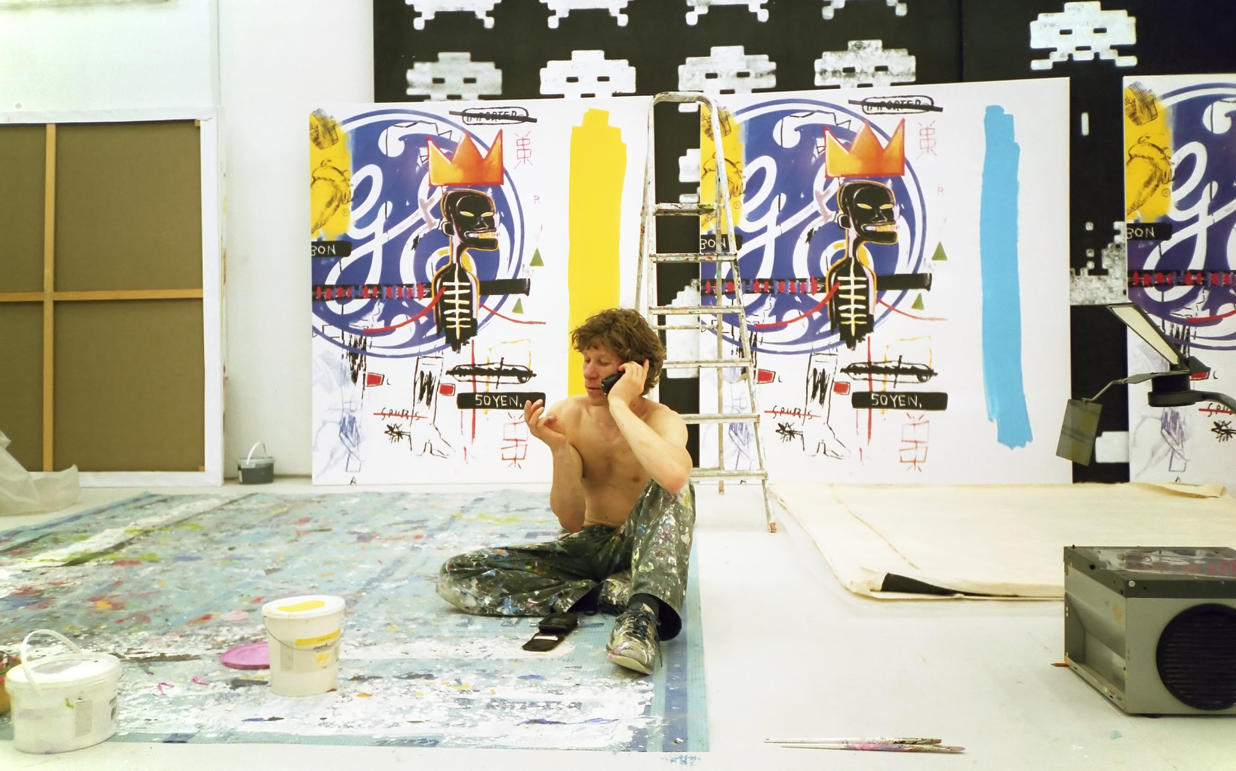
Michel Majerus
the making of a legacy
KunstWerke // n.b.k, Berlin // neugerriemschneider // Studio Majerus // Michel Majerus Estate
Berlin, end of 2022 – early 2023
Power Ekroth
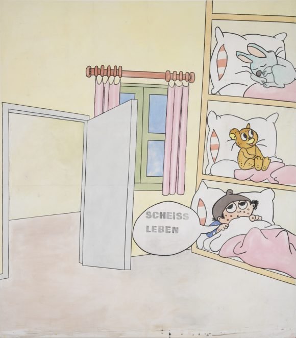
Michel Majerus, Scheiss Leben, 1991.
„SCHEISS LEBEN!“ (SHIT LIFE!), said the giggling teenager while pointing at a painting.
My inner teacher is instantaneously triggered, and the rant is irresistible: “Did you know that this painting was made in 1991? It means that this painting was made way before the internet meme as we know it was born.” She looks back at me and says “Whoa! I hadn’t thought about it until now, but almost every painting in the exhibition works exactly like a meme!”
A meme can be defined as a piece of media, repurposed to deliver a cultural, social, or political expression, mainly through humor. It has the ability to capture insight in a way that is in complete alignment with the zeitgeist – and thus in ways that has invaded the realm of conceptual art. If one wanted to be daring, one could say that the meme killed contemporary art.[1]
As we know, “killing” an art format or media tends to strengthen it, not only by generating zombie-versions but also making it more adaptable to current times. This was something Majerus was extremely aware of, and used as an engine in his work when he dealt with painting, which has (falsely) been accused of rigor mortis plenty of times.
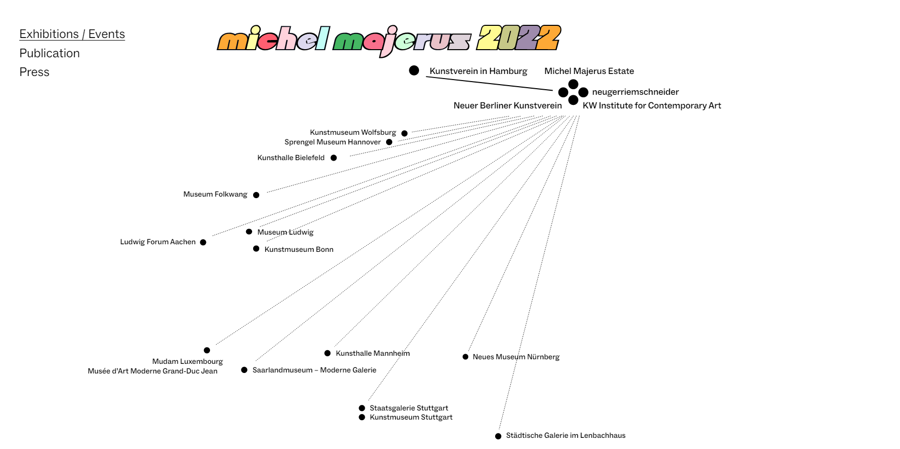
Michel Majerus died in a tragic plane accident in 2002 when flying from Berlin, where he lived, to Luxembourg, where he was from. He was only 35 years old and had already reached quite some fame as an artist along with other Berliners of the same generation, many of which were connected to the same gallery, neugerriemschneider. Twenty years after his death, Majerus’ works were celebrated with 18 (!) exhibitions in many major institutions all over Germany during 2022 and early 2023.
A map of the exhibitions with Majerus’ works during 2022 from the webpage www.michelmajerus2022.com.
I started to write this text already in October 2022 but was unable to finish it until now, almost six months later, partly because I knew Michel personally. Is it even possible to have a credible critical stance when one is so evidently biased? I will opt for full disclosure. He and I worked together at Lydmar Hotel in Stockholm, a little more than one year before his untimely death, with a large-scale wall painting in the restaurant of the hotel. Just a few months before the crash he also had agreed to do a project for SITE. We always laughed together when we met, and we talked about art in the same particularly nerdy way. I liked his him and I liked his art. I still do.
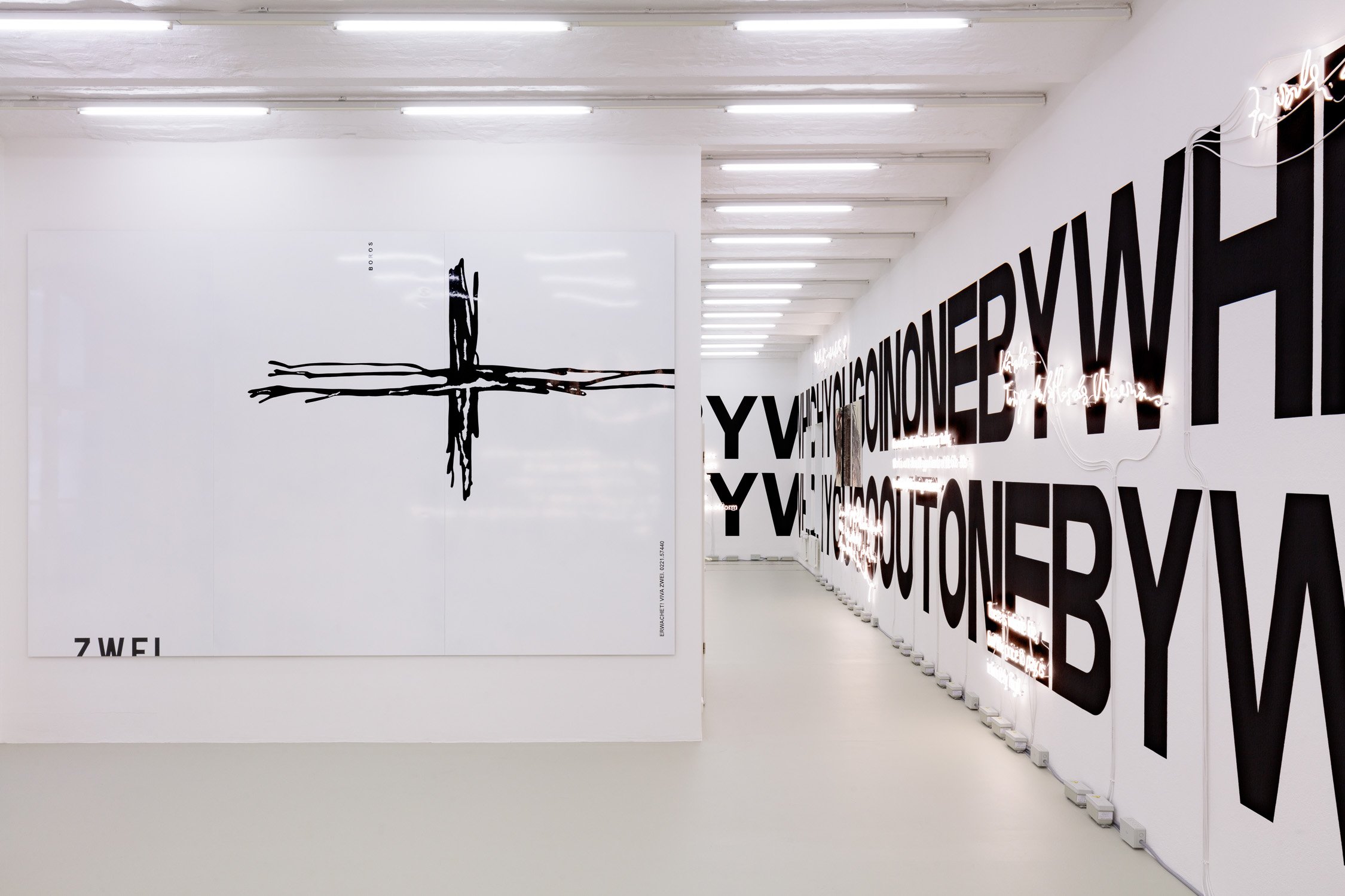
It was therefore with both excitement and a big chunk of melancholy that I went to see his solo shows in Berlin, which by the way felt a little like a “home-coming” of sorts. Even if Majerus was born in Luxemburg, and partly lived in Los Angeles during his last years, he was indeed a genuine Berliner. It was here he invested in a home and a large studio in Prenzlauer Berg, a studio that now hosts an archive and exhibitions run by the estate of Majerus, and right now there is an exhibition running with works by Majerus and his teachers Joseph Kosuth and K.R.H. Sonderborg.
kosuth majerus sonderborg – an installation by Joseph Kosuth, Michel Majerus Estate, Berlin, 2022. ©Joseph Kosuth / VG Bild-Kunst, Bonn 2022
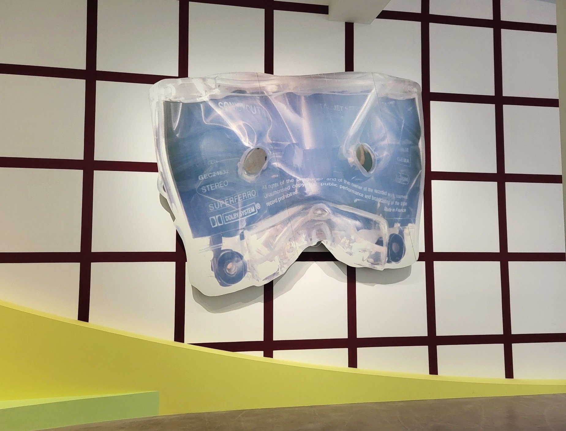
Majerus’ works were always about painting in its purest forms, and even though he treated painting quite mischievously, he nevertheless was an old-school formal painter. As a product of his time, he used many different materials other than paint in his work such as stickers, computer printouts and what not – he also painted on a variety of surfaces other than the regular square flat-surfaced canvas.
In an article by Taylor Defoe (Artnet) entitled “Was Michel Majerus the Most Important Artist of His Generation?” Majerus’ is described as a quintessential postmodernist, and as someone who was “hyperaware of the folly of being a painter at the dawn of a new century – endless movements, eras and isms at his back, all flattened by the internet. But it’s not just from a place of existential anxiety that he operated; a boundless enthusiasm also pervaded hit work.”
His combination of reverence and complete disrespect towards painting was appealing, as it was paired with a great sense of humor. One could find the deep irony that his generation was known for in his works, as well as the willingness to also be transparent of one’s own deficiencies and personal problems. His approach to formal painting was conceptual, and this is probably a key to his success in the artworld. It was just about perfectly balanced: both conceptual enough to piss off the formalist painters, and just about formally flawless enough to piss off the hard-core conceptual artists.
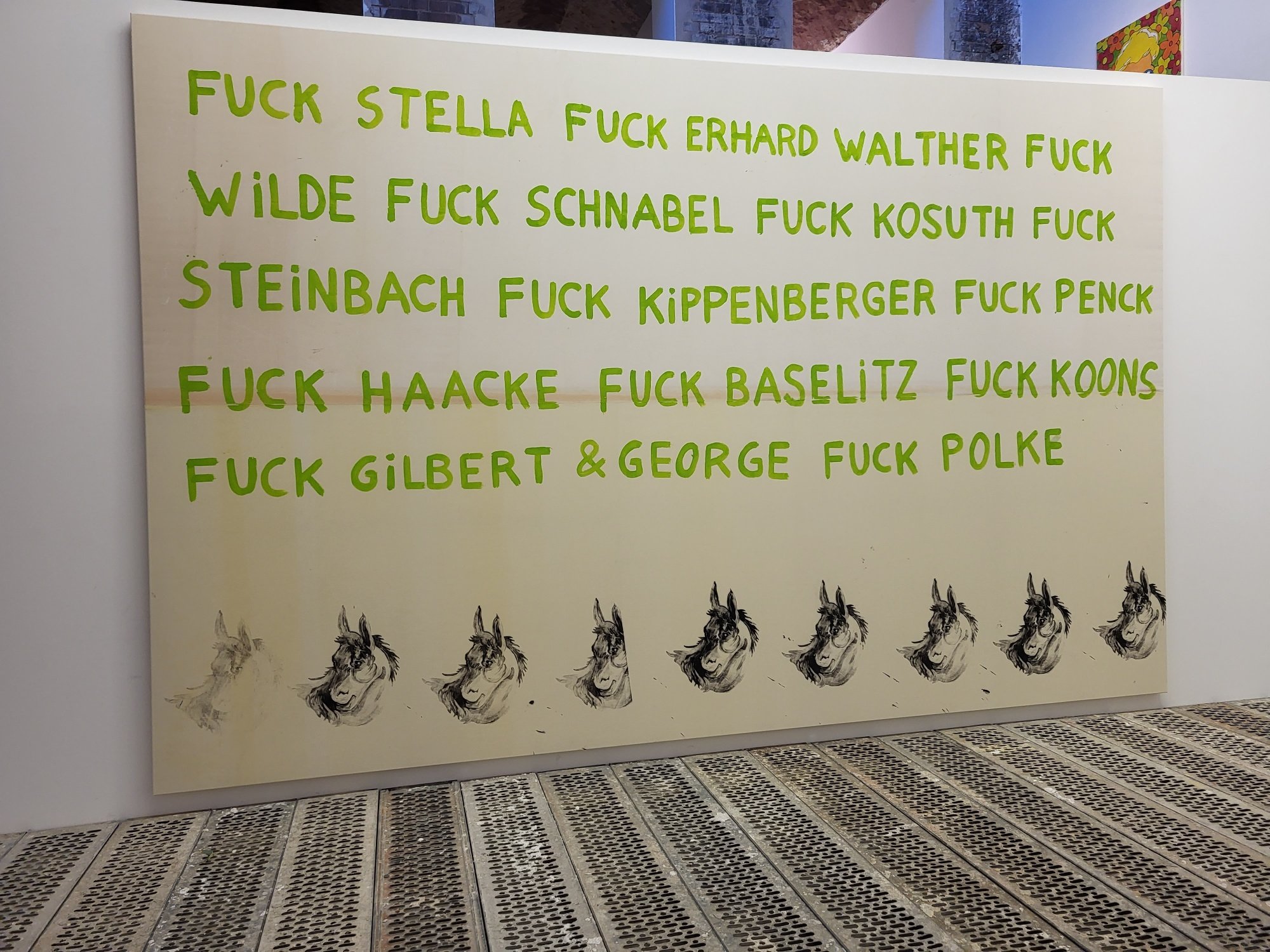
Michel Majerus, Fuck, 1992. Photo from KunstWerke by Power Ekroth.
This rather mischievous attitude towards art history had him pick and choose from art history, and he put a lot of artists in the blender and poured the result on his own canvases. It is easy to recognize sources of inspirations in paintings. Two of the painters that Majerus was sampling from more than usual were James Rosenquist, who started out as a billboard painter, and the conceptual artist Joseph Kosuth – whom he also studied for in Stuttgart. Other frequent recognizable guest appearances were made by Andy Warhol, Frank Stella, Jean-Michel Basquiat and Gerhard Richter.
Majerus was indeed an artists’ artist. He was highly regarded amongst his peers and had a huge influence on artists based in Germany in general and especially in Berlin – but he was not so well known outside of Germany. His international recognition outside of artists’ circles has largely happened after his death. He may still not be an over-the-counter name everywhere, but after this year it will be difficult to be oblivious even outside of Germany.
Early works
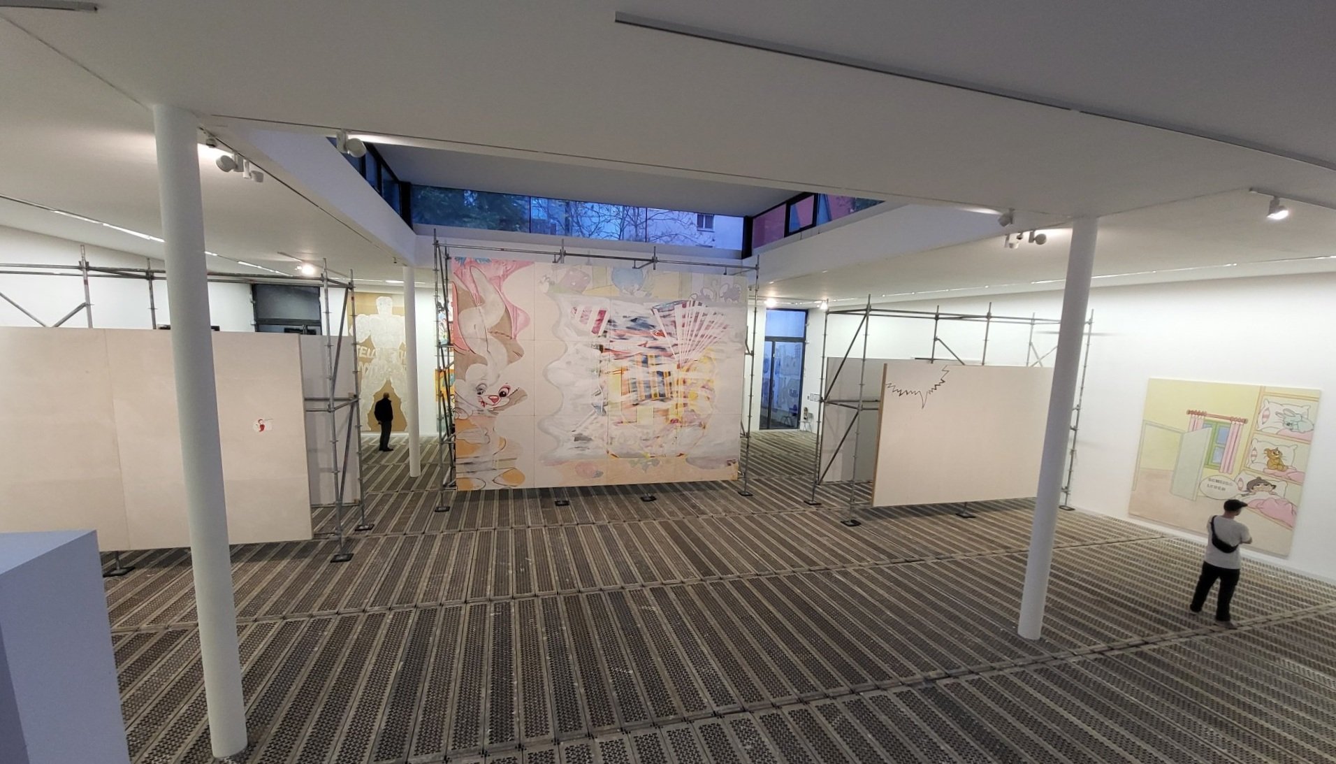
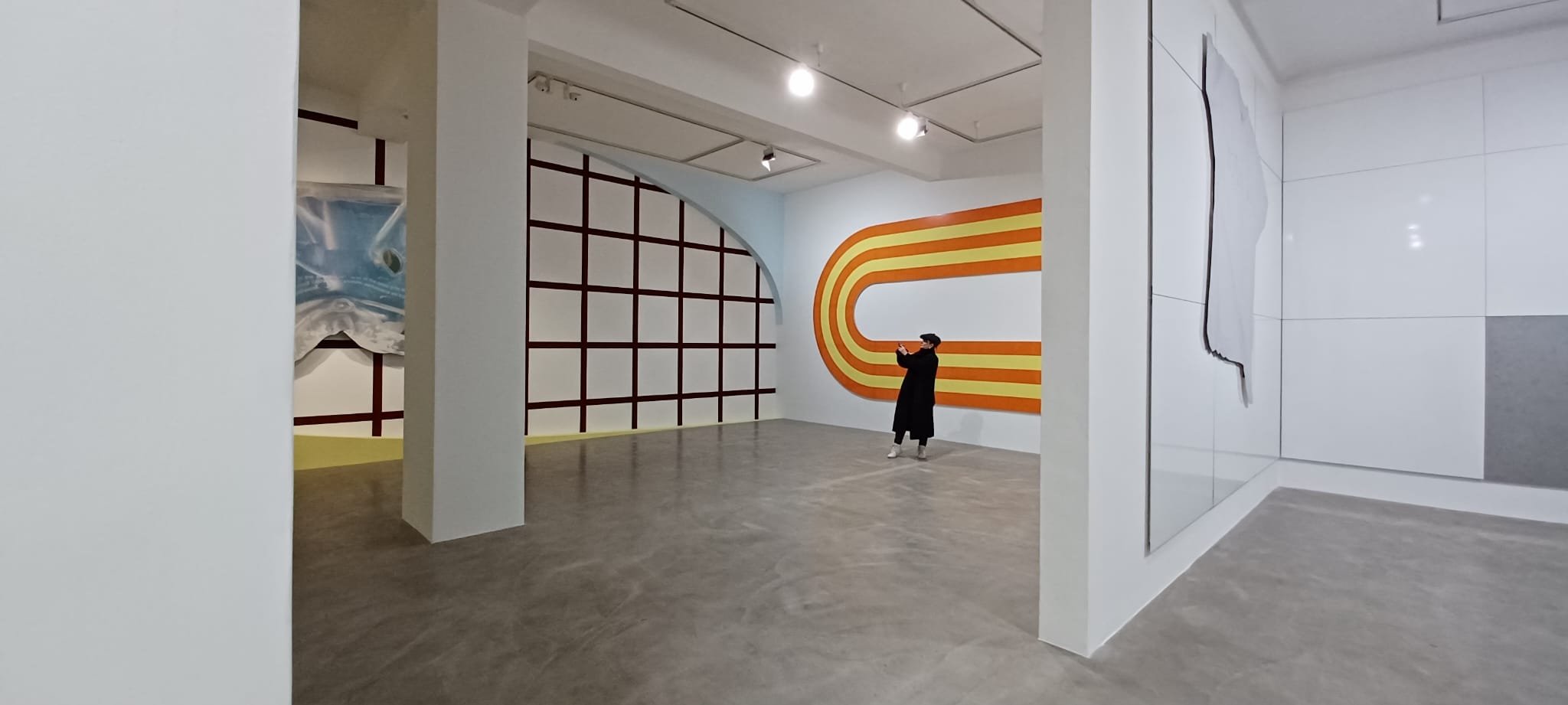
The exhibition at KunstWerke, curated by Krist Gruijthuijsen, gave us an insight into the so-called early works of Michel Majerus, if it is possible to talk about “early” when the entire career was only ten years long. The many large scale, or rather huge scale, paintings also functioned as the exhibition architecture as it was mounted on scaffolding in the largest exhibition room. Just like in one of Majerus’ earliest solo exhibitions, in Basel, the floor was entirely covered with scaffolding, and it comes with a creaking sound as visitors walk on it. The conscious use of a physical environment belonging to the street and pavement points the visitor in the direction of what preoccupied Majerus in the early works: the bombardment of messages and imagery, often commercial or political, in the streets.
Installation image, KunstWerke, Berlin. Photo: Power Ekroth
Bits and pieces of this type of imagery show up in the paintings such as logotypes, LED-signs, graffiti, and intermixed commercial pieces of ads or manga-figures. Add the layer of (funny) texts, cartoons, old DDR symbols, Super Mario figures and of course a lot of surfaces with only a layer of primer paired with bright colors. It wasn’t only the messages of the street that were incorporated, because instead of simply using the computer and the programs as tools to process ideas – he used the program or game itself as an influence, and appropriated graphic parts, buttons or texts like “Always use a player mode.” Another example would be when he integrated the result after using the smudge function in Photoshop in his large-scale painting of the US flag, controlling the moonlight maze from 2002. I suppose this makes him one of the first in the so-called post-internet artists.
Michel Majerus, controlling the moonlight maze, 2002, Foto: Doc Baumann, photo from the exhibition “Images” im Museum Fridericianum, Kassel
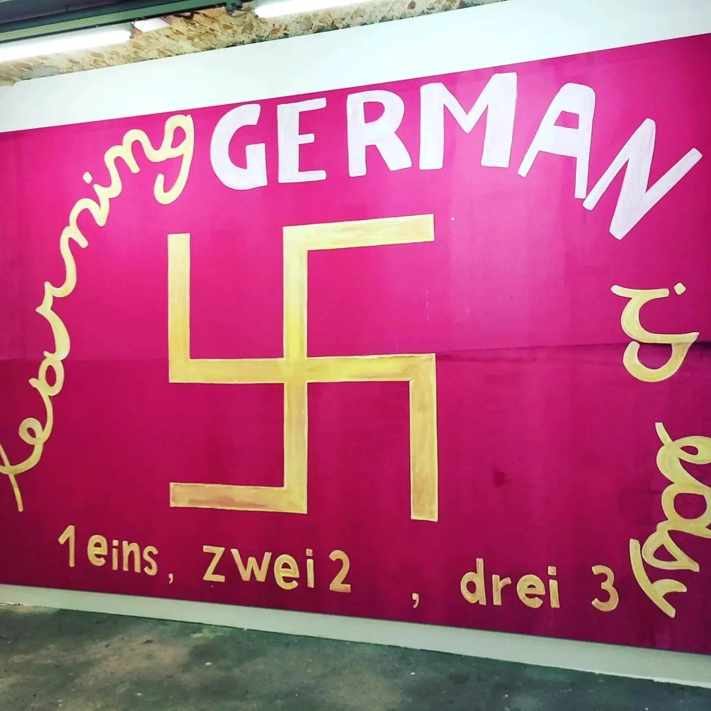
Michel Majerus, eins, zwei, drei, 1992.
The early works, just after the wall came down and Majerus moved to Berlin from Stuttgart where he studied, Berlin was the epicenter of so many pop-cultural phenomena. The industrial techno clubs of Berlin had their own aesthetic, the Love Parade, and the clash between the graphics of two political systems generated a landscape of what must have been a visual joyride for Majerus, who recorded so many small details with the camera that he brought with him everywhere, creating a vast archive of images to be used in his works. In 1992-1993 Majerus was part of an artist collective named 3K-NH – with Wawa (Wawrzyniec) Tokarski, Stephan Jung, and Susa Reinhardt. The group declared a need “to expose the uselessness of communication in general, and of advertising and art in particular,” as well as to “embody the threat that the average person is not exposed to, but which he needs as a basis for his existence” (statement by 3K-NH, exhibition catalogue, Stuttgart 1992-1993).
While the conglomerate of all these meticulously recorded details, brought together with a visually recognizable expression and a vibrant palette, does make Majerus an interesting artist, but it does not necessarily make him stand out amongst the peers of the time such as Franz Ackermann, Johannes Wohnseifer, or Daniel Richter. Majerus was simply one of a great deal of interesting painters and artists belonging to a certain time and place coming up.
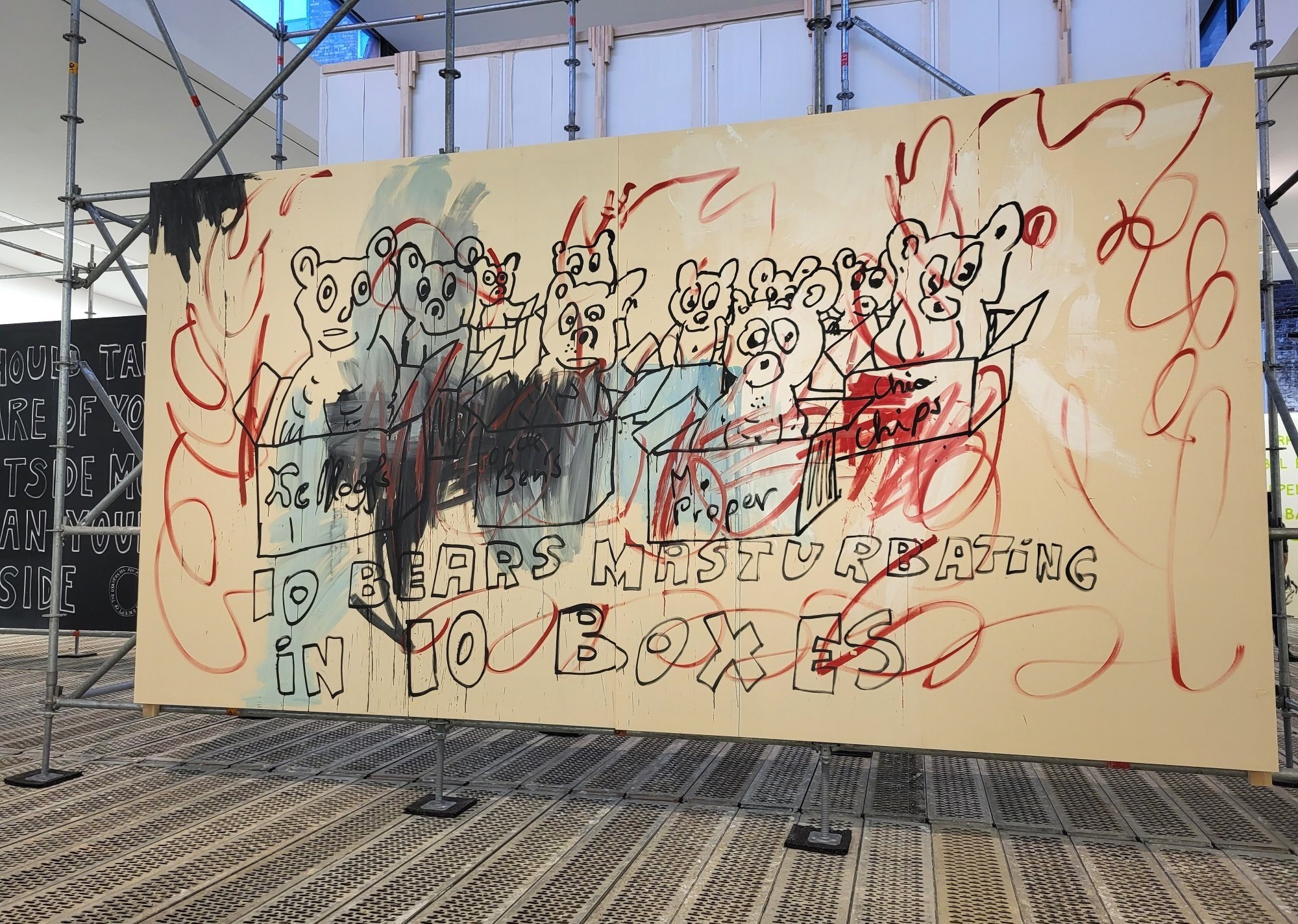
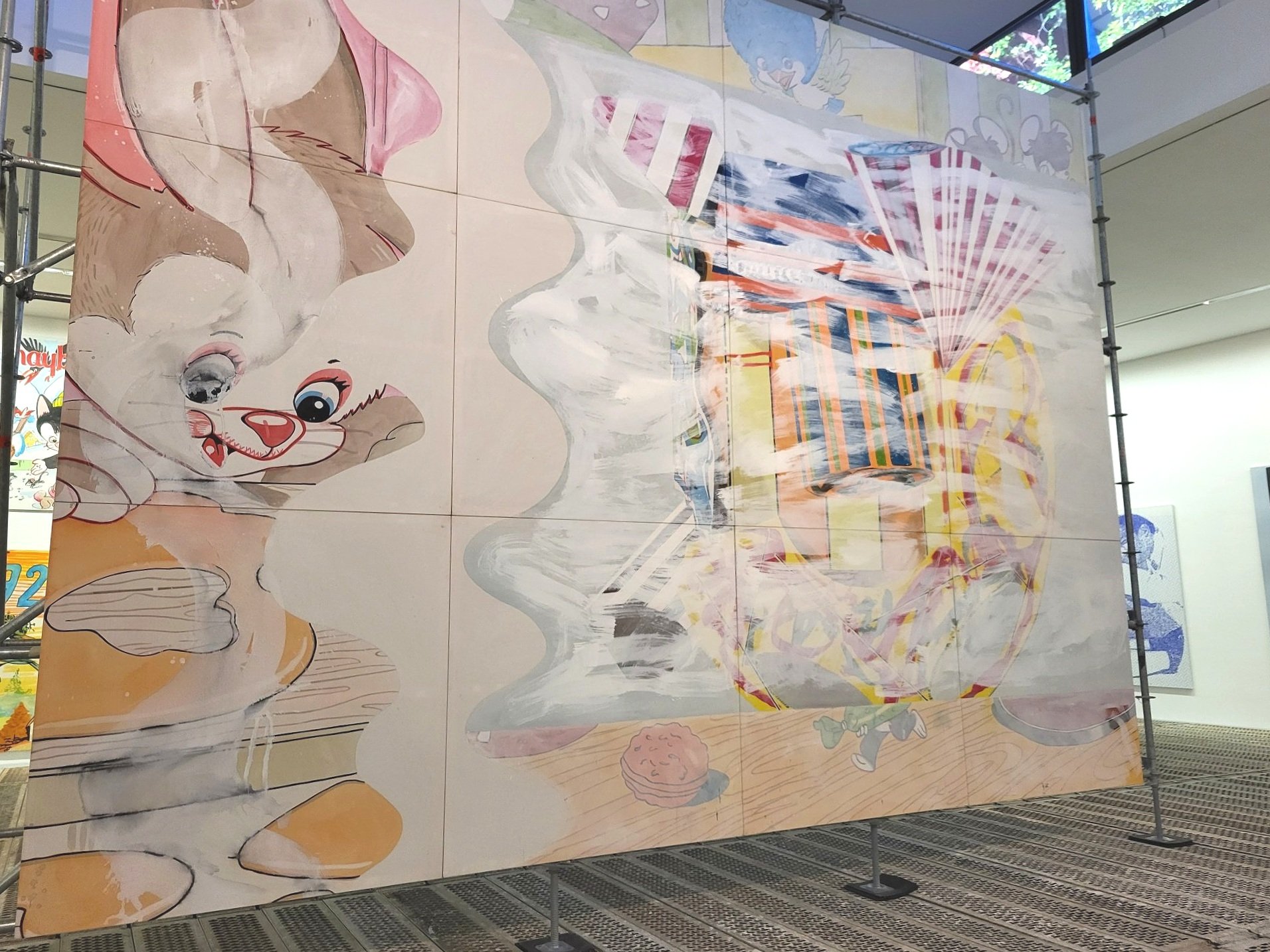
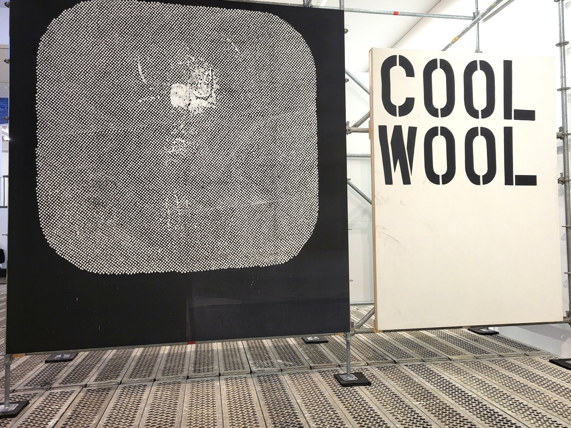
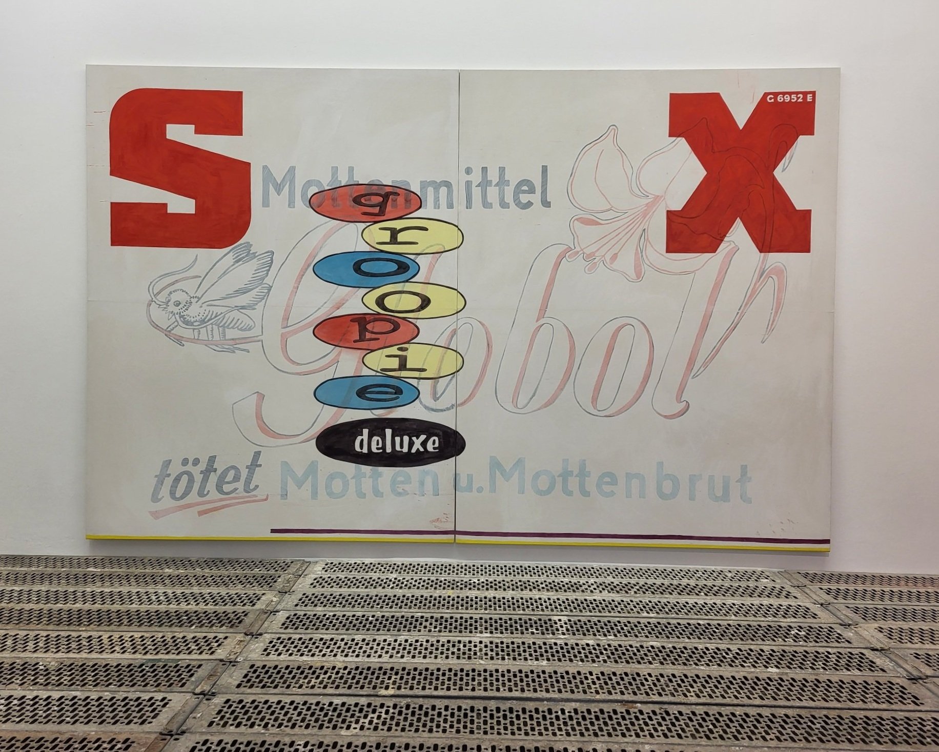
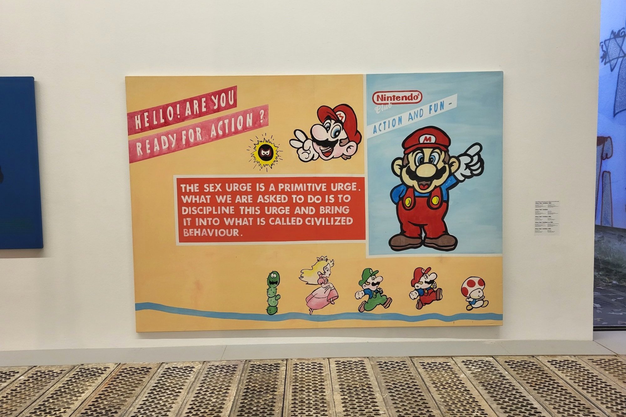
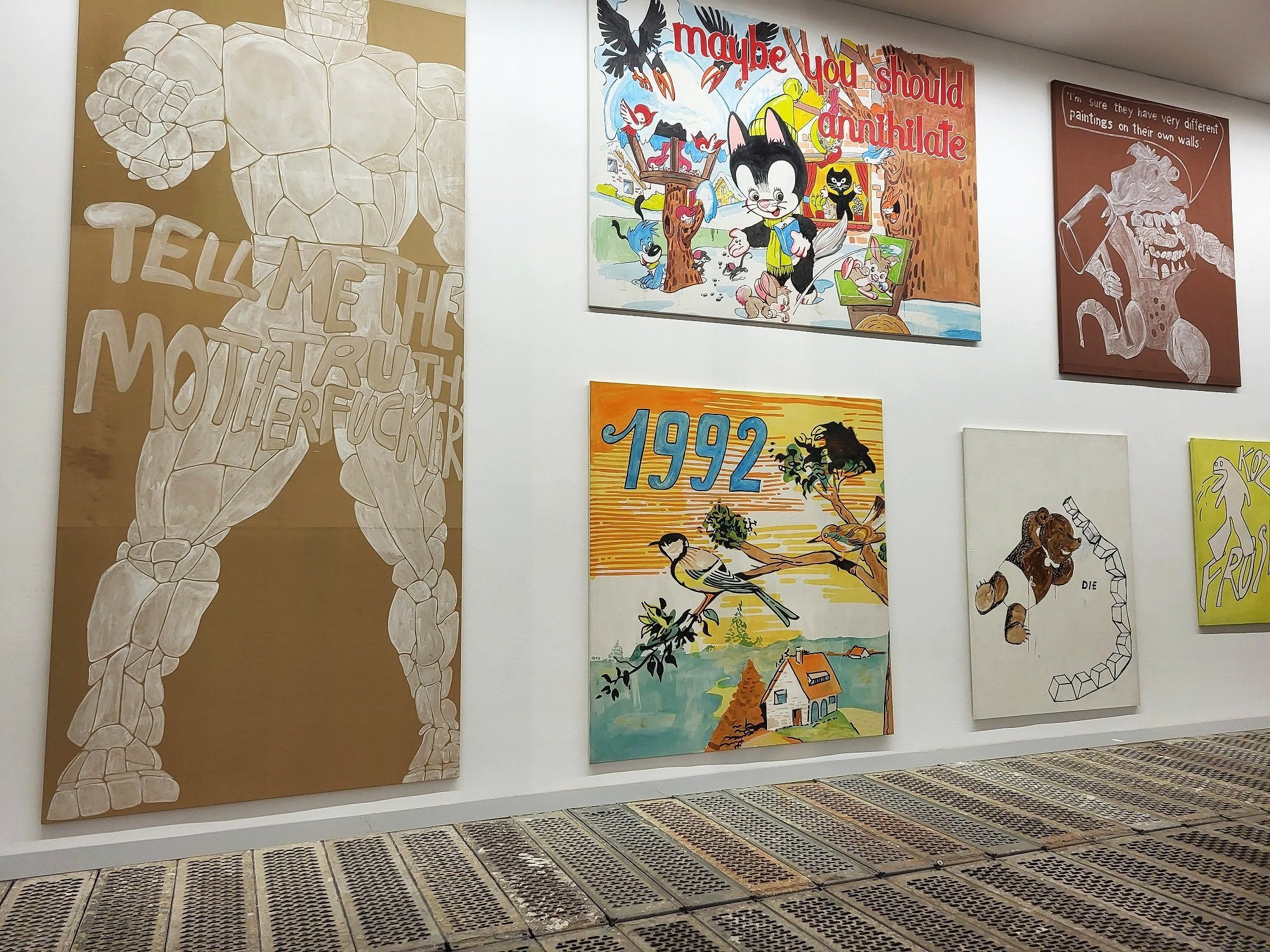
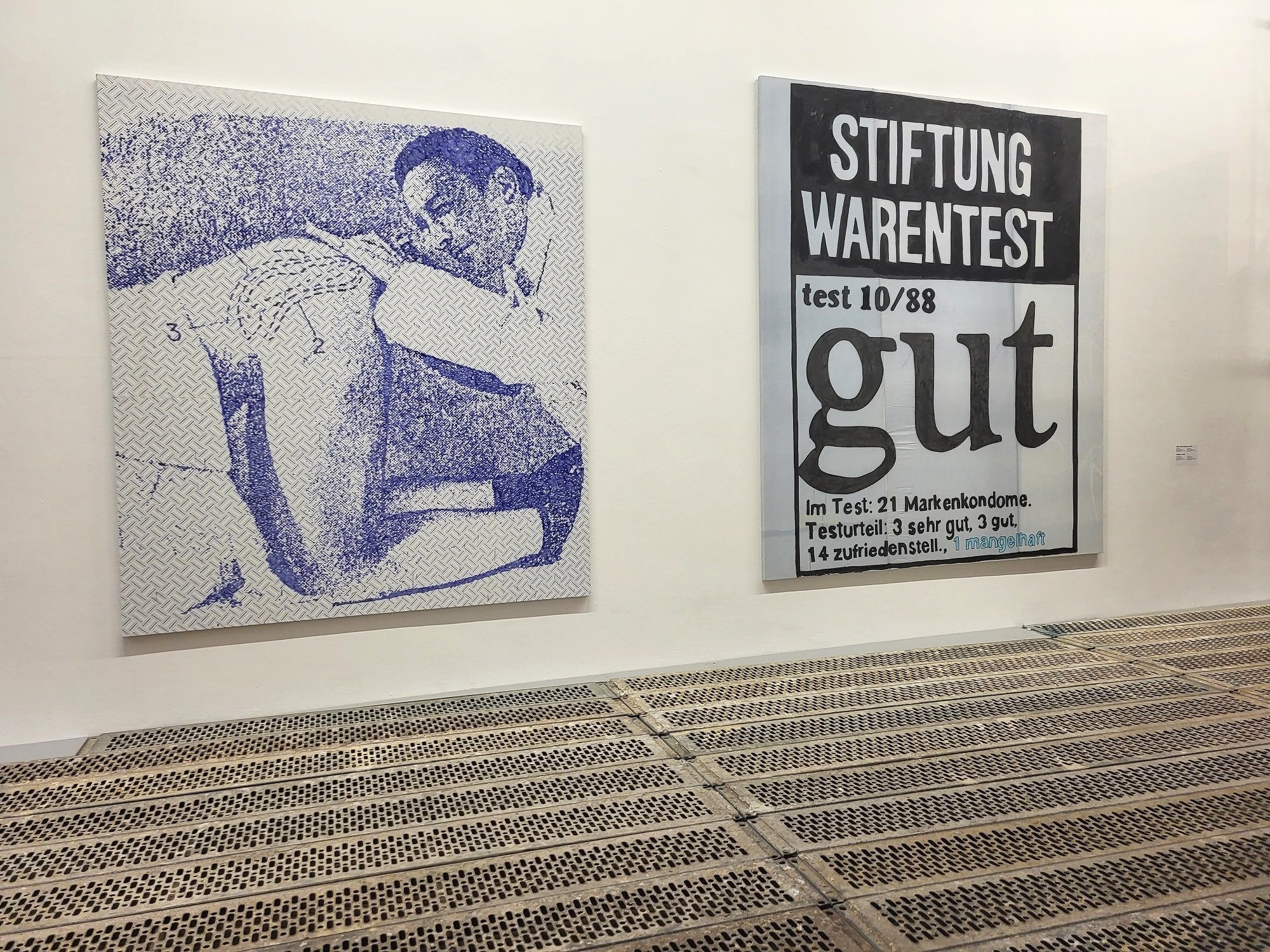
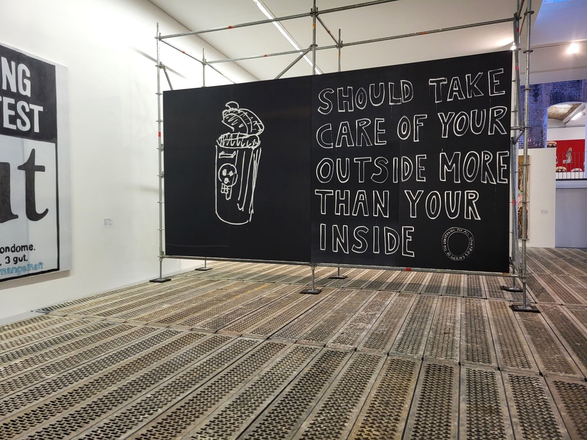
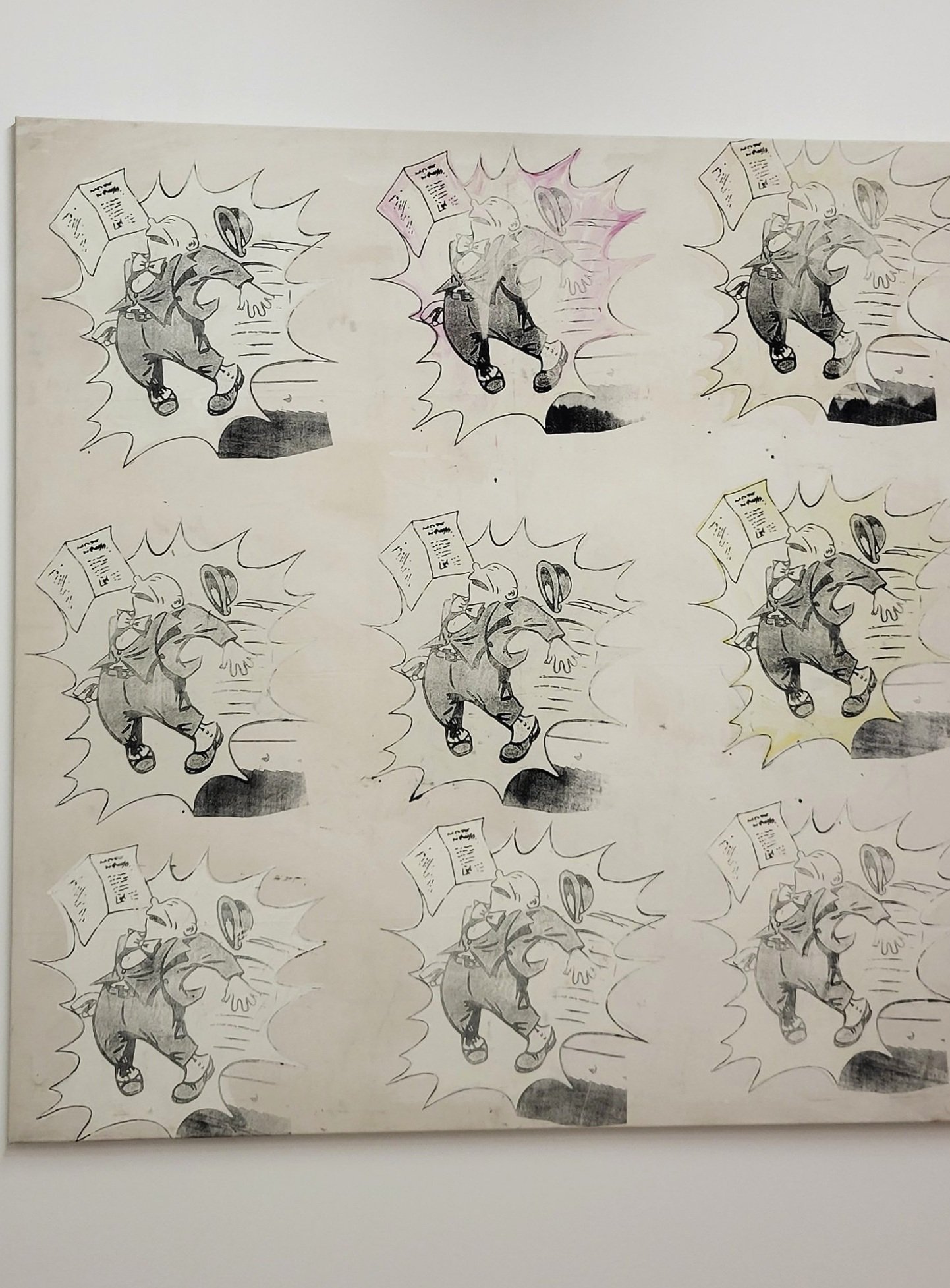
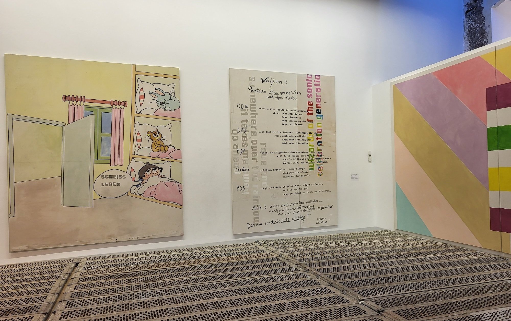
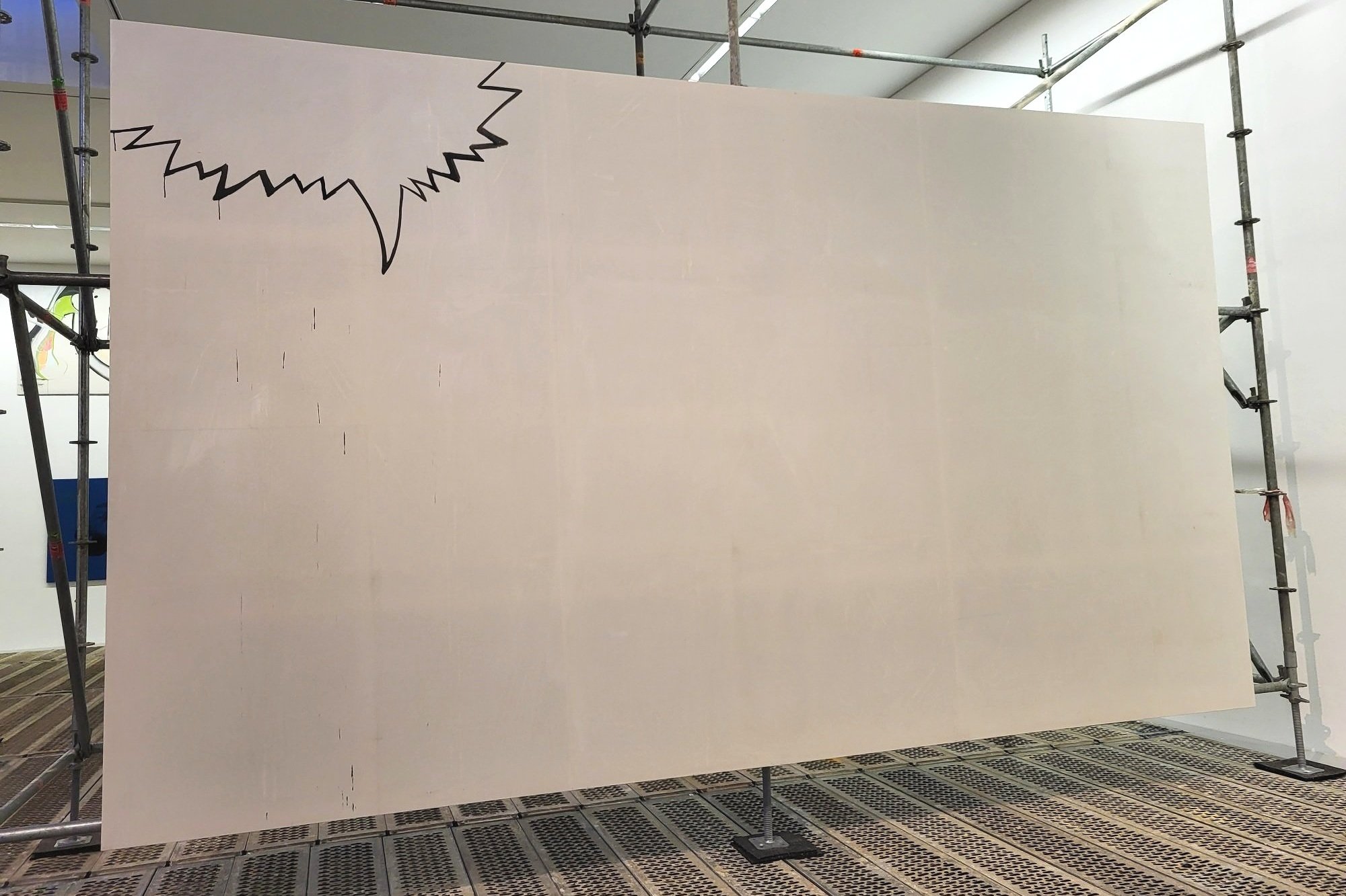
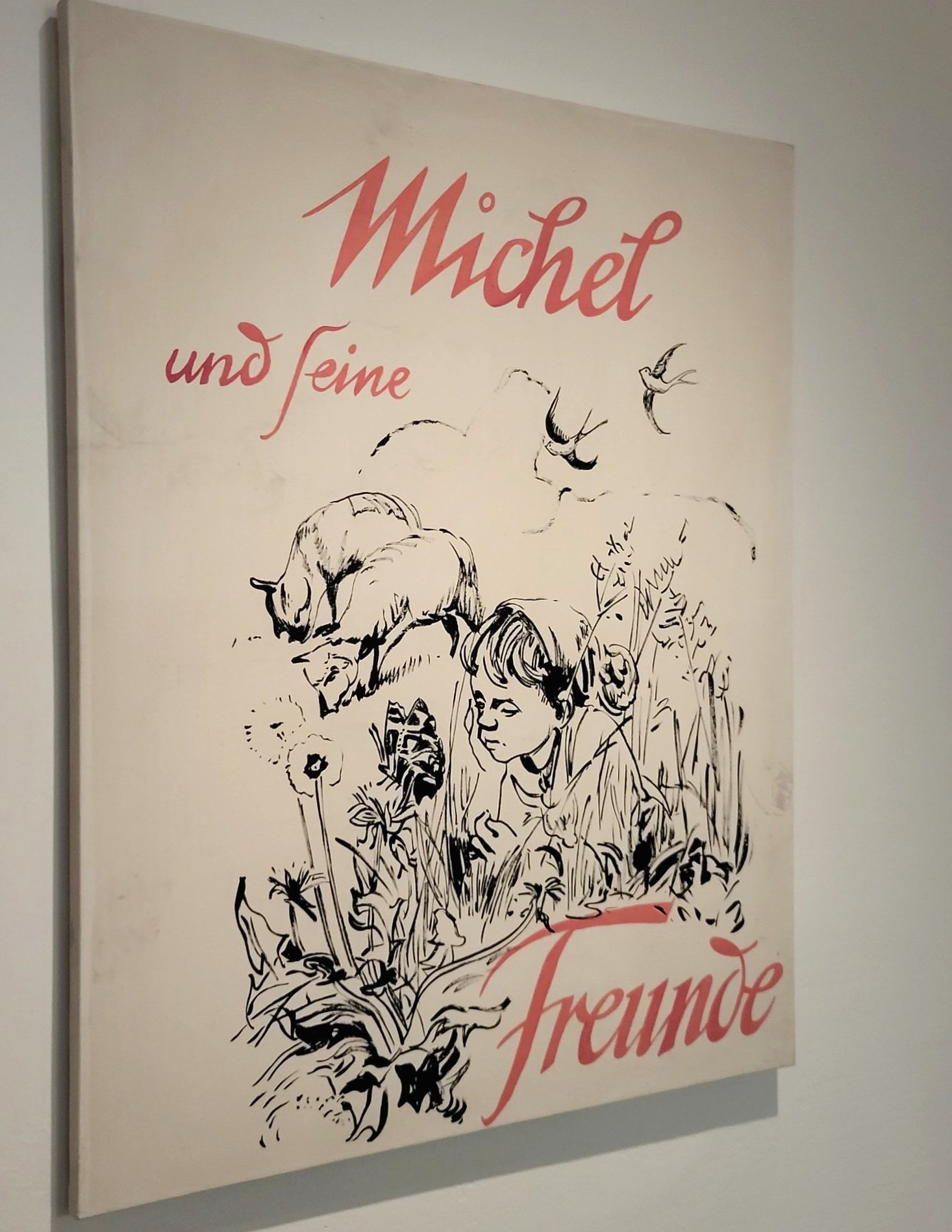
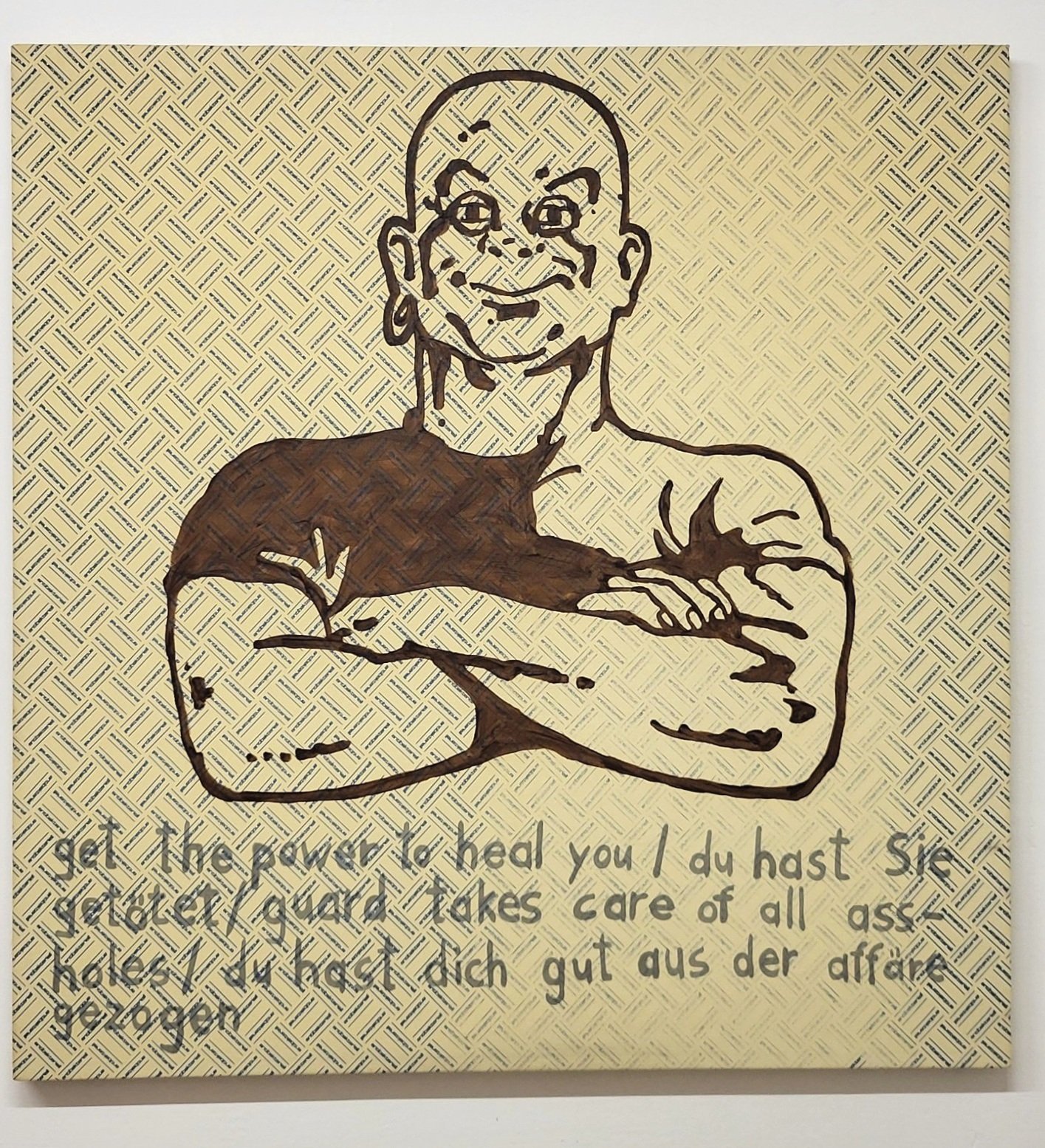
All images above from the exhibition with early works by Michel Majerus at KunstWerke, taken by Power Ekroth.
Majerus left more than 2000 works of art behind, and a large amount of public art, mostly of a temporary nature. The early works still today ooze of freshness and vigor, but also, quite frankly, of aloofness. And it is a sign of his times. Clearly, the early works are marked by irony, but also of anger against society – many critics have pointed out that he was rebellious against his own bourgeois upbringing in the early paintings, and that may be perfectly true, but there was nothing really punk or anarchistic about his persona. He was smart enough to use the system to his advantage, and he did that well. After all, already since 1993/1994 he was working with one of the most clever galleries of his generation, neugerriemschneider, and he was selling works already from the get-go to prestigious collectors.
In the basement of KunstWerke, a recently produced documentary is projected with clips from Majerus own camcorder, interviews with his parents, friends, girlfriend, gallerists, and assistants. Although the gesture is well-intended and the film well-produced, and it gives the audience a better understanding of the persona of Michel Majerus, it also enhances a feeling best described as dismay.
Walking out of KunstWerke and into a micro-depression
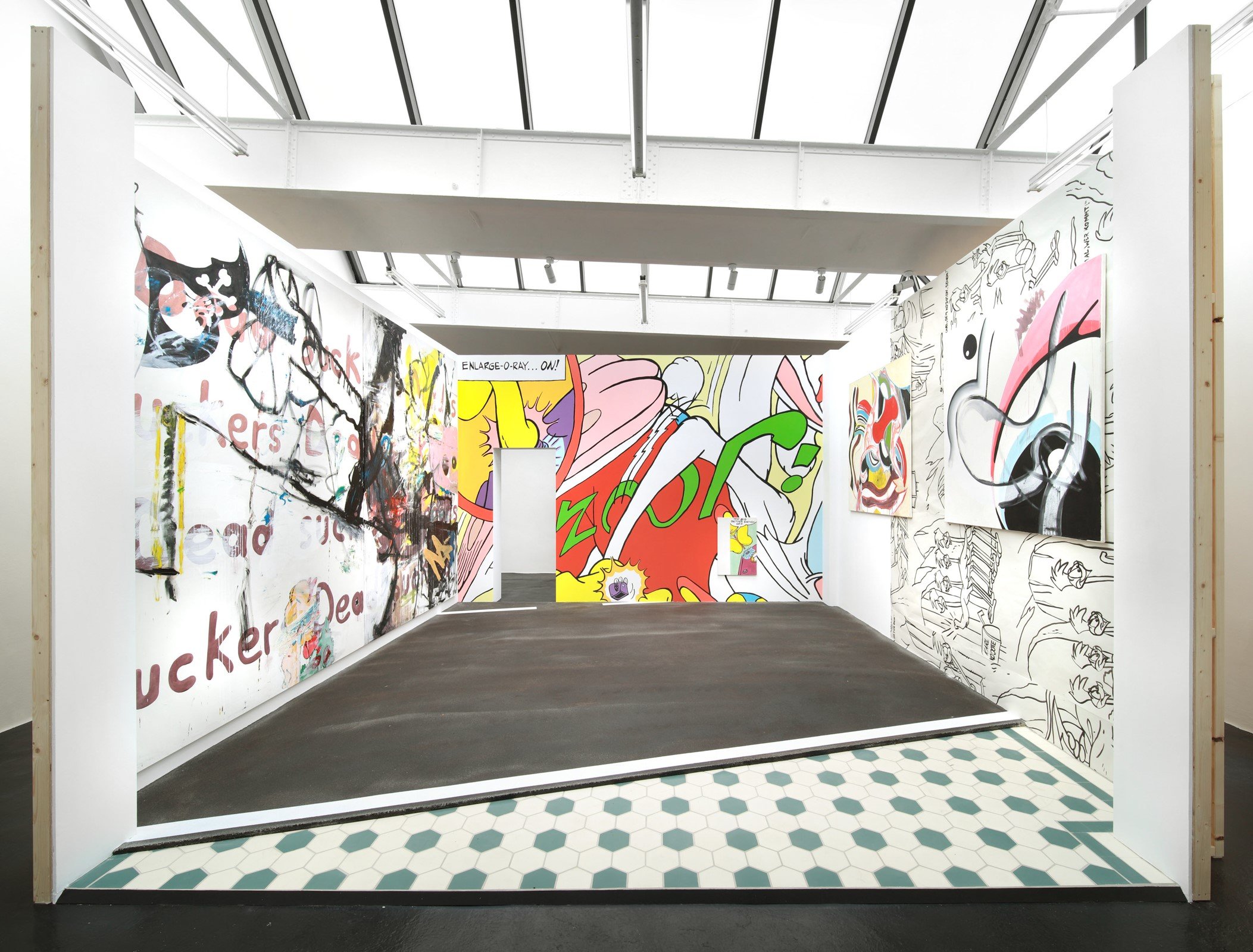
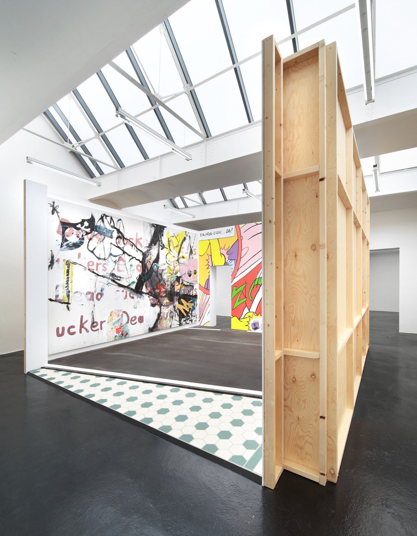
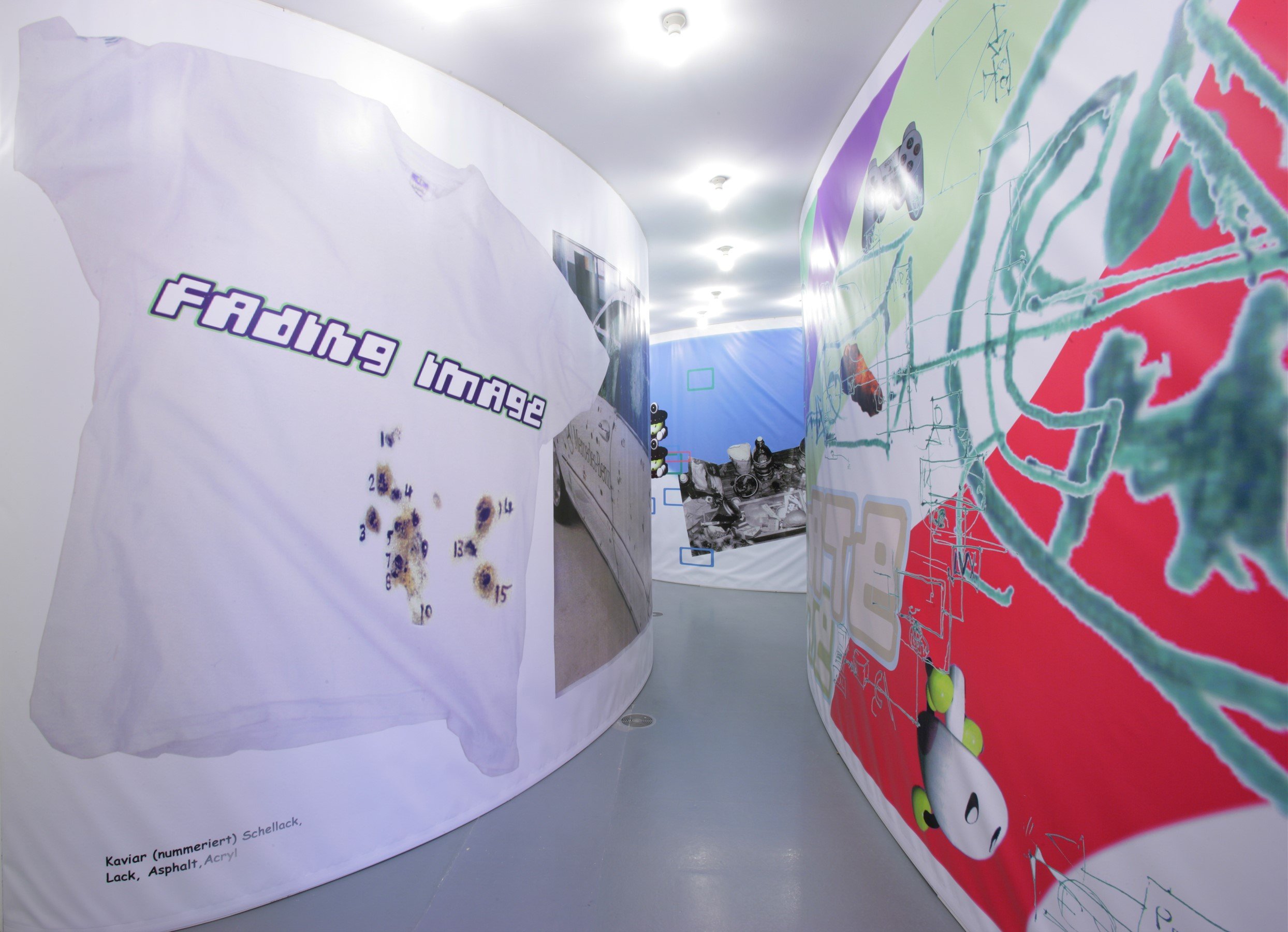
At first, it was difficult to comprehend just exactly why this discomfort appears. Clearly it is neither about the works, nor about the exhibition in KW, which was neatly curated, and it was not about my own grief of a lost friend either. The reason became clearer after visiting gallery neugerriemschneider just a few hundred meters away, who carefully recreated the very first exhibition of Majerus at the gallery in 1994. Unfortunately, the installation, as cool as it is, leaves an even larger void in the heart as it comes out as mannerist and, well, staged in a tone-deaf way. If Majerus was alive, would he have wanted a nearly 30-year-old installation to be recreated in an exact museum-like manner? Probably not. The recreation of the installation is set out to be nostalgic, but instead it comes across as cynical. Sure, the installation is cool, it was even cooler back in -94 of course, and perhaps it is more interesting to see the massive installation instead of more square paintings in the gallery, but somehow it feels more like a marketing strategy than an adding of depth to an artist’s oeuvre.
Installation images from the reconstruction of Michel Majerus first exhibition at galerie neugerriemschneider in 1994, 2022.
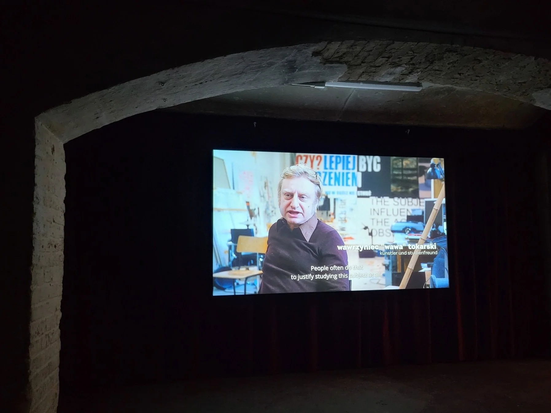
Wawa Tokarski about his friend and study buddy, Michel Majerus.
In the documentary, Burkhard Riemschneider, one of Majerus’ gallerists (the other being Tim Neuger) of neugerriemschneider, explained what happened in the aftermath of Majerus’ death. The artist’s worldly estate was treated just as meticulously as a historic excavation site. Majerus’ laptop was saved in the crash and was largely reconstructed, enabling the gallery to extract every bit of digital information about past and future art works. Moreover, they went through the personal belongings in the studio that also functioned as Majerus’ home – finding art works under the bed etc., and Riemschneider states that they "had to reconstruct a person" as well. Surely this is what we do with all our loved ones once they pass away, so why does this feel different?
When an artist dies, the rules of supply and demand kicks in. Suddenly, even a large amount, in Majerus’ case more than 2.000 art works, becomes a limited supply, and the demand rises. It seems obvious that one of the reasons for the reconstruction of Majerus’ persona, estate, and artworks is a matter of creating and recreating a persona as a commodity on a market, even though there certainly are sentimental reasons here as well. But the eighteen exhibitions around Germany feel like a full-scale spectacle, the building a myth, a myth we certainly will love to treasure, a myth about a loving, fun, passionate, and “genial” artist. Yes, Majerus was a person that was likeable if he let you into his world. He was nerdy and fun, but not at all attention-seeking or spectacularly charismatic; indeed an interesting person due to his seriousness about art and with lots of integrity. After revisiting his early works at KunstWerke and neugerriemschneider, however, the gravity needed to carry 18 large institutional exhibitions that will inscribe his artwork into the eternity of art history seemed sadly, and quite simply, not present.
Twenty years after a death it might seem like an appropriate time has passed to drum up an even larger demand on a market. Granted, things are not all that cynical. And the beneficiary to a great extent is the loving parents who lost their only son. Still.
The irk is hard to shake. Defoe’s article in Artnet also mentions how the eighteen exhibitions in Germany, as well as a large solo at the ICA in Miami, are “just in time for Art Basel Miami Beach, where Majerus’s paintings will also be on view as part of Neugerriemschneider’s booth. But it also comes—and perhaps not coincidentally so—amid the emergence of a larger, market-driven trend coalescing around the artist’s work.”
On top of the arrangements of making Majerus a pillar saint, there is the apparent lack of the type of maturity that comes with an aging artist. The path Majerus was on would have allowed him to take a wider grasp on the reality we live in and engage in it rather than mirroring it from a distance. Somehow, he really was on his way, but it is not evident in his early works.
Relief!
Fortunately, the irk is not entirely unshakeable. Partly, a relief is served in the film documentary by Majerus’ long-time friend and assistant, Bastian Krondorfer, who at one point says what feels absolutely correct: “With all the fuss about his work now, he [Majerus] would have laughed his head off!” Krondofer is today professionally helping institutions all over the world to recreate the “Majerus’ touch” to the installations, which entails, for instance, to mix the correct color nuances for the installations. This is so genuine and spot on, one can almost hear the echo of Majerus’ laughter, and it’s a laughter full of disobedience, a bit of mockery but also, of course, full of pride and artistic integrity.
Vitrine with the model for the installation if we are dead, so it is. Photo: Power Ekroth.
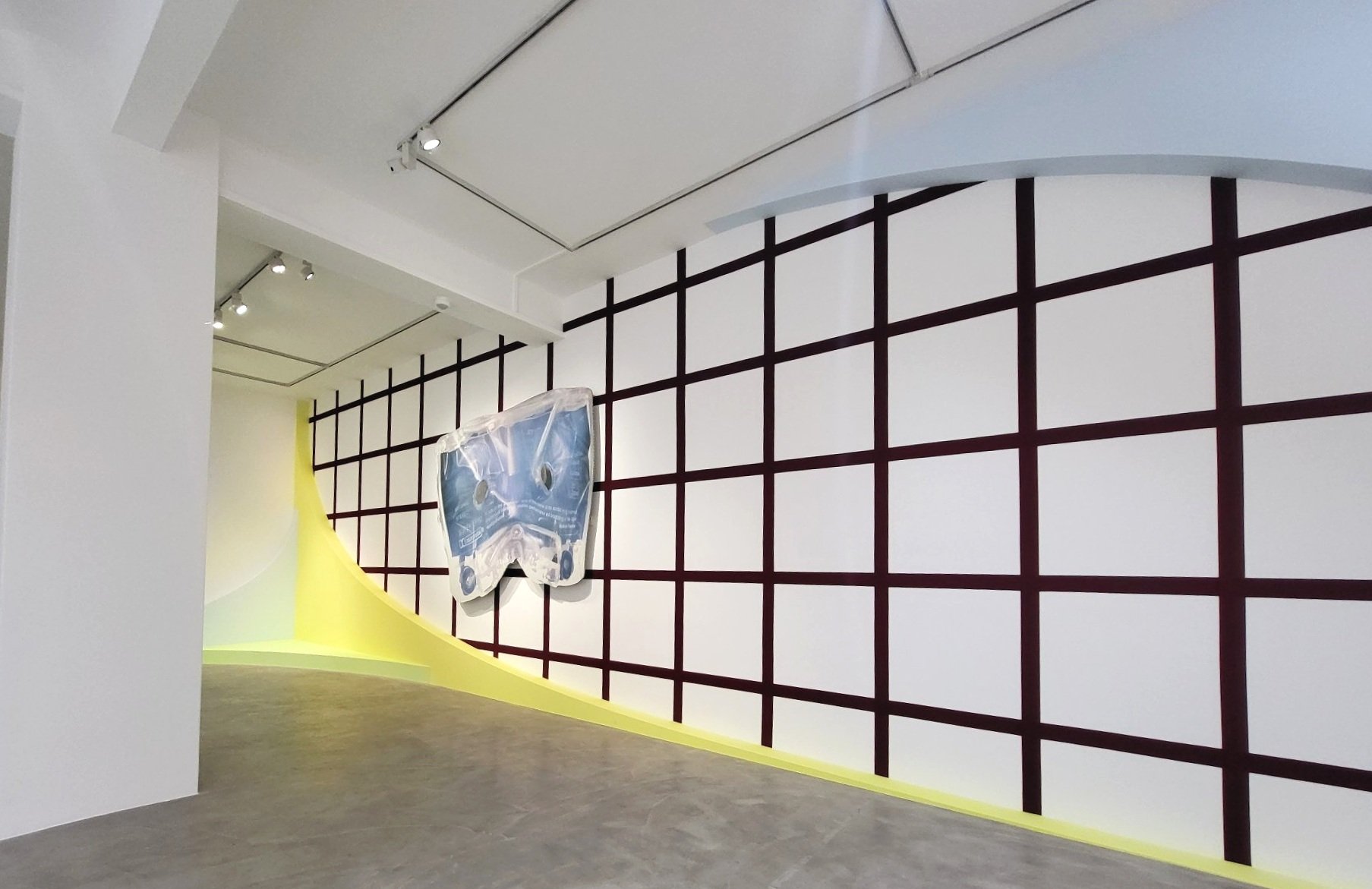
The greatest relief, however, comes with the impressive gravity that really appears in Majerus’ larger public installations, represented with a few smaller interventions, documentations, and models in the exhibition at n.b.k curated by Michaela Richter. The exhibition at n.b.k. was spaciously installed. One even gets the feeling that not much at all was on display, after having seen the initial moving image installation, an animation with a graphic design of his own name, displayed in a way that was common in the early 2000s in Berlin. Nevertheless, here, for instance, the model for the large, no, huge scale installation if we are dead, so it is from 2000, originally installed at Kölnischer Kunstverein as a central piece, is presented in a glass vitrine.
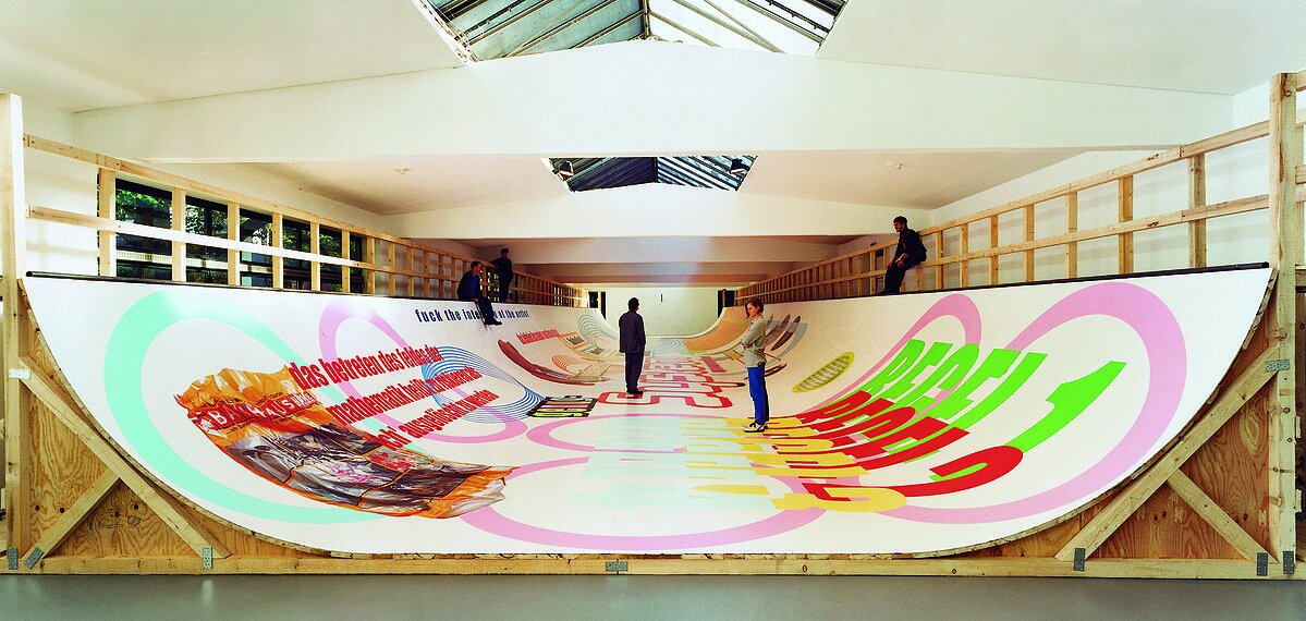
Above and left: installation shots from if we are dead, so be it.
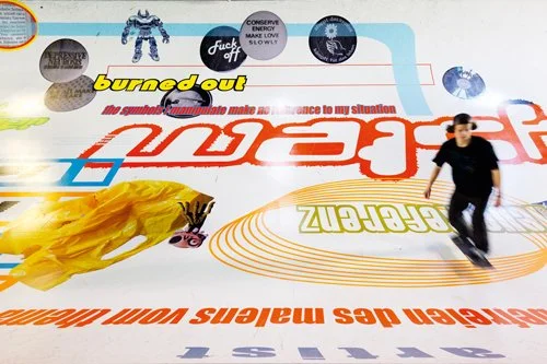
This huge installation (46 meters long and 10 meters wide) became the large breakthrough for Majerus, and it was the piece that convinced so many that he was to be counted as a major player in the art world – and, on a personal level, why I wanted to invite him to Stockholm. The installation consisted of several rooms in a row, where the largest room, inhabited by the largest painting that also functioned as a skate-board ramp, was the most impressive. The painting didn’t only represent the expanded field, it was the expanded room, and it consisted of paint and prints.
Certainly, the title of the work resonates very differently after Majerus’ death, but the “we” in the original intention was aimed at art, or artists, in general. Or as Raimar Stange puts it in Michel Majerus, Installationen 92-02:
As a whole, with if we are dead, so it is, 2000, Majerus deliberately created a concrete metaphor for the loss which “real life” always undergoes in the space of art: becoming more or less just a visible image. Although the gap between everyday life and art is intended to be as minor as possible, it obviously still cannot be bridged.
On the ramp, it's possible to read “fuck the intention of the artist”, and “regel 1, regel 2, regel 3” (rule 1, rule 2, rule 3), or “labeled labeled labeled” plus many other things commenting commercialism in the art world. The model shows the original plan, which obviously changed for the real exhibition. Here, the original cut-outs from the comic magazines that were about to be magnified over huge walls are glued to the walls in the model, and the playfulness of the installation shines through. Now, what is more impressive in this work is perhaps not necessarily that a painting is made big and used as a ramp, instead, it is the way Majerus is managing, in fact, possesses, the room(s). Room, life, and art are fused into one.
Michel Majerus, the space is where you’ll find it, 2000
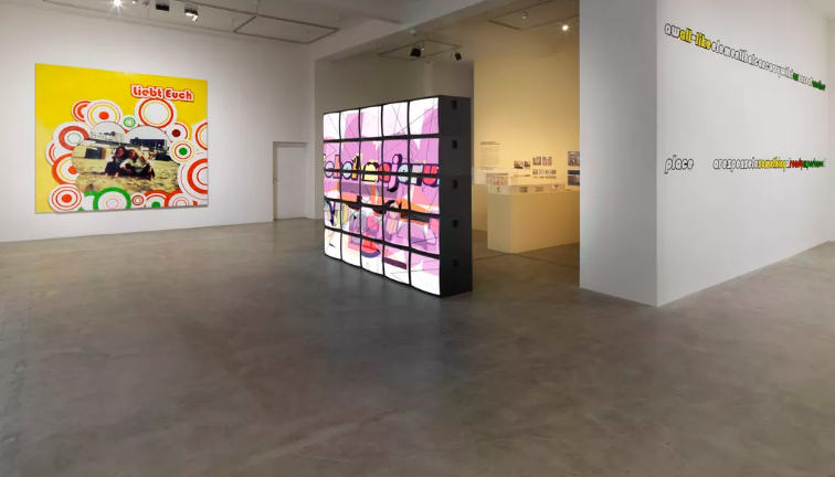
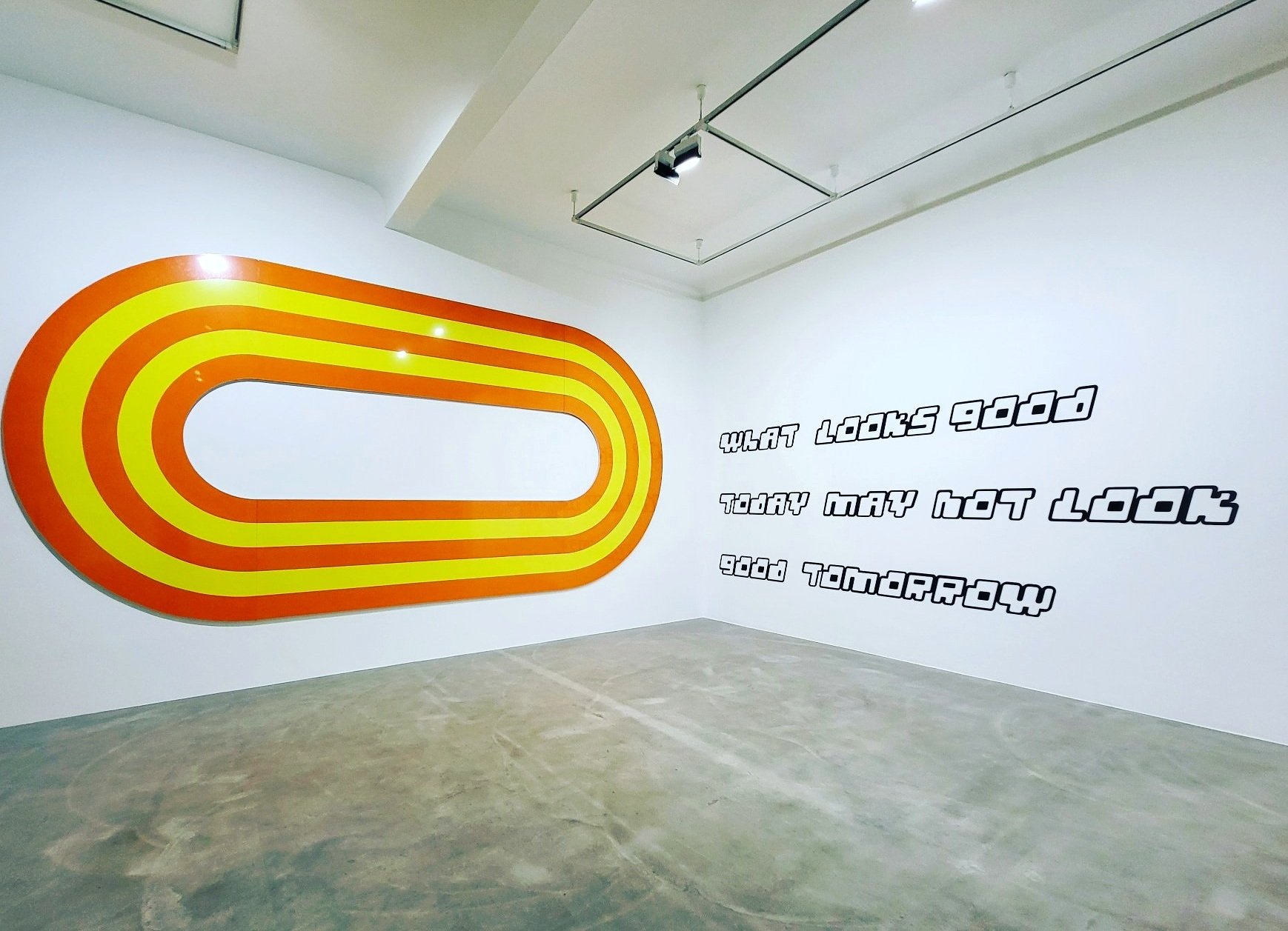
Building structures, cutting up walls, and using spatial interventions as a canvas was something Majerus did continuously, using a layer-on-layer technique in which the spaces in themselves becom dynamic paintings. At n.b.k, the installation what looks good today may not look good tomorrow could be seen, whose title says a lot about how self-aware he was, and also about how he willingly used irony as a shield against critique. The spatial paintings comment on the galleries of the museum as idealized, heavily constructed, and non-neutral. Majerus pointed in a direction in which art can be treated like a natural part of our lives, instead of as something unreachable, untouchable, or sometimes unapproachable.
Installation shots from n.b.k, Berlin.
Cocaine is a hell of a drug
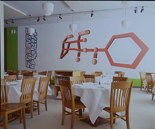
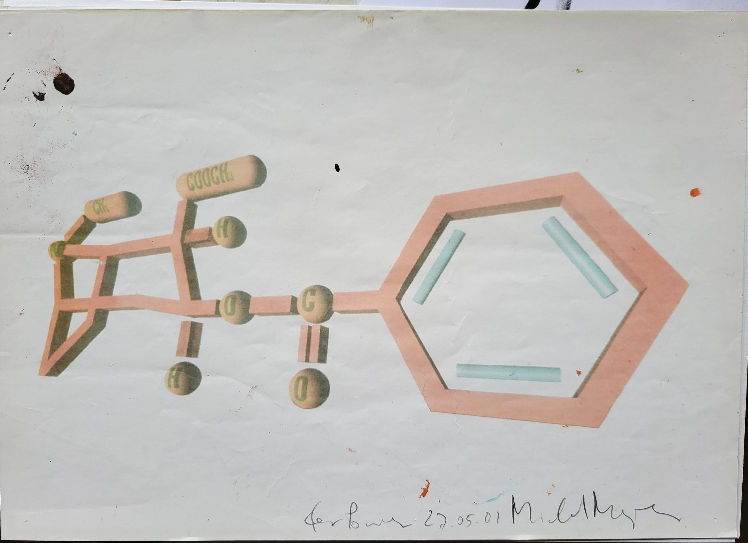
This fuck-all attitude was how he rolled in Stockholm as well. For a little more than a week, Majerus and his friend and collaborator Wawa Tokarski stayed at Lydmar Hotel in Stockholm. The print that was mounted on the side of the painting also gave the name to the work “Errvolk, Everybody Sucks”, and hidden behind were three words, of which one could see only “dumb” and “ass.” “Errvolk” is not a word in German, but it combined “err” as in “error” or “making an error” and “Volk” as in “people,” and it was a word play Majerus enjoyed. The orange-red colored chemistry molecule represents the chemical binding of cocaine, and it created somewhat of a inhouse stir. The day before the opening, there was a demand from the hotel management that the molecule would be covered with white paint or changed into a more harmless content, and the demand was directed to the artist himself (bypassing the curator/me). The drug cocaine was not a laughing matter at a restaurant downtown Stockholm that had struggled for years to abolish the use of drugs in their clubs. Majerus discussed changing one letter in the molecule transforming the content to carbon instead of cocaine, and management were satisfied with the solution. Upon finding out, I asked Majerus if he really found this to be a good solution, and he shrugged his shoulders and just laughed at the situation.
Installation shot from Restaurang in the Hotel Lydmar, Michel Majerus, Errfolk Everybody Sucks, 2001. Original sketch to the right.
Two days after the grand opening, the bar personnel had dug up their old high school chemistry books. Triumphantly they declared to me that the letters were unchanged, and that they indeed had a large cocaine molecule facing the bar and that management was notified. Now the painting was threatened to be painted over immediately. But it didn’t happen. Perhaps this was due to the positive words of a critic in the largest daily newspaper in Sweden. Regardless, the defiant Majerus managed to trigger a debate on censorship that lasted a full summer among the personnel at the restaurant and the bar.
Sozialpalast
As cool and sexy as all these massive works were, they were all overshadowed by the politically charged public work Sozialpalast, curated by Daniel Birnbaum at Brandenburger Tor in Berlin during the autumn of 2002.
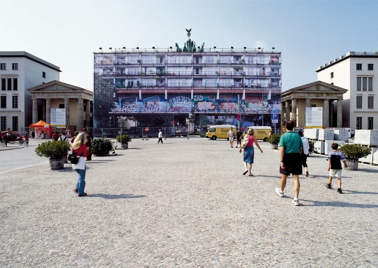
It must have been a dream come true to be able to execute a work from idea to extreme finished scale on top of the most symbolically charged symbol of Berlin city. The Brandenburger Tor gate was undergoing renovation and needed to be covered in scaffolding for a longer period of time, and an artwork by a contemporary artist was called for to “cover” the scaffolding so that a “normal” scaffolding would not shame the city. Majerus’ mischief stroke hard when he chose to print out an image in scale 1.1 of the so-called Sozialpalast, a modernist and rather run-down building complex in Schöneberg, housing more than 2.000 residents, notorious for being a precarious social hotspot. The print measured a staggering 17 x 39 meters and dislocated the Brandenburger Gate, once built as a Prussian army procession gate, today perhaps mostly remembered as a backdrop for massive nazi rallies. Only the quadriga was still to be seen, the symbol that once was stolen by Napoleon and brought to Paris, only to be reinstalled after Napoleon’s defeat a few years later.
Michel Majerus, Sozialpalast, 2002.
The Brandenburger Gate is used by almost all news outlets as backdrop news related to Germany, Berlin or the German government, and official statements still gain traction when using the gate as its backdrop. When Angela Merkel was interviewed in front of the Majerus installation, it created a very different imagery than was intended. Placing a modernist, run-down building with satellite dishes, graffiti, and sun-shades on the balconies, on top of the Brandenburger symbol sends out a simple message about what is symbolically worthy of exposure in the public realm and what is not. It also points a finger to social make-up falling apart and deconstructs the spatiality of the city, underlining its failures to be hospitable for everyone.
And for Berliners, lastly, it was a very critical statement about the debacle concerning the Palast der Republik, the huge building that hosted the DDR government, abandoned since the fall of the wall and filled with asbestos. The large, centrally placed building with copper gold coated windows, modernist and bombastic, was a symbol of a totalitarian past and diverse problems, but also of shattered ideals. That the building once was erected on top of the previous City Castle/Berliner Schloss of Friedrich II was indeed a thorn in the side for many, and finally, in 2006, the decision was made to demolish the Palast der Republik and put up a replica of the Berliner Schloss, now the so-called Humboldt Forum – a pretty insane conservative project and an attempt to reinstate a bourgeois pilgrimage deemed to be ridiculed for decades.
Not even two months after the Sozialpalast image was taken down from the gate, Majerus was dead.
But this simple gesture in the city space, unapologetic and impertinent, also paved the way towards a different art in the public realm, participating in a debate that was in line with the personality of a more mature artist with an ability to take on the society at large – with a cheeky smile.
Michel Majerus in his studio, ca. 2001. Photo: Edith Majerus.
[1] An art work by artist Jan Christensen from 2023 states exactly this: “The Meme Killed Contemporary Art”.


